What is flexbox?
What is flexbox?
Flexbox is a way to arrange items into rows or columns.
These items will flex, that is, grow or shrink based on some simple rules that
you can set in your CSS.
Flexbox is not just a single CSS property, but a whole
toolbox of properties that you can use to put things where you need them. Some
of these properties belong on the flex
container, while some go on the flex
items. This amazing toolbox can help you create beautifully structured
layouts for your web pages. Flexbox gives us complete control over the
alignment, direction, order and size of our flex-items.
Alright, at this point you might be wondering, “what is a
flex container?”, and maybe also “what is a flex item?”. Please don’t worry too
much, we are going to take everything one step at a time.
Shall we?...
What is a flex-container and a flex-item?
A flex container is any element that has the CSS property
and value of display:flex.
Just in case you’re not sure what a CSS diplay property is,
please feel free to check out this article, where I talk about the display
property and two of the most common values it can have.
When an element is given this property and value (display:flex), all the elements within this container element become flex-items. In other words, the flex items are the elements inside a flex container.
display:flex, while a flex-item is any element
within a flex-containerThe image below would make the point clearer.
Let’s get a practical application of this, shall we?
Please enter your favorite code editor and create a folder (📂)
for this demonstration.
Feel free to name the folder anything you want, preferably, “flexbox_practice”.
In your new folder, create a file and name it "index.html". we
would use this in writing our HTML code.
Also create an additional file named "style.css". This file
would hold our CSS styling.
Now lets write some codes.
Please enter the following lines of code in your HTML file just created
Also, enter the following lines of code in your CSS file
When you view the output of the code on your browser, you’re going to get an output similar to this...
Now, lets turn the container div into a flex container. To
do that, we simply add “display:flex” to the css styles for the div we want to
turn into a flex-container like this…
Have you added that line? If yes, save your code and refresh your browser to see the changes. You would get an output similar to the output below on your browser.
Now, the container div has become our flex-container, while
the elements within the container div have become the flex-items. We can now set the sizes, order, alignment
and direction of the flex-items within our flex-container.
The scrollbars were only necessary before adding
“display:flex” because I wanted you to be able to see the normal flow of the
elements before adding the flex property. Now that we’ve added the property,
let’s get rid of the scroll bars, since they are not necessary to the
demonstration at this point. We can get rid of the scroll bars by replacing the
value of the overflow property. In
place of “scroll”, let’s put “hidden” like so…
Now we should get the same output but this time without the
scroll…
So far, we’ve been able to create and identify a flex-container,
and a flex-item (any item within the flex container). Next, lets see how we can
set the alignment of our flex-items using some flexbox properties.
Alignment with Flexbox
Flexbox allows us to easily align our flex-items both vertically and horizontally. With this alignment properties, you can easily position a flex-item at the top, center, bottom, left, right and several other positions.
Horizontal alignment
From the introduction, I mentioned that some of the properties
of flexbox go on the flex-container, while others go on the flex-items, do you
remember? I’m sure you do 😉👍.
To align the flex-items horizontally, we use the justify-content property on the flex-container.
justify-content property on the flex-container.This property can take one of several values – center, left,
right, space-around, space-between, space-evenly. The images below would help
create a pictorial view of what we’re talking about.
Let’s practicalize this, shall we?...
Let’s update our CSS by adding the justify-content property
to the flex-container (the div with an id of "container"). For starters, we’ll set the value of
this property to be left just as you can see in the image below…
Save your code and
view the output on your browser. You should get an output similar to the first
output on the image showing the various outputs for the respective
justify-content values (left). Try out other values (center, right,
space-around, space-between, space-evenly) to see the output on your browser.
Please note that the last three values (space-between,
space-around, and space-evenly) focuses on how the space around the flex-items is distributed.
Vertical alignment
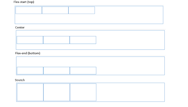
Just as with horizontal alignment, to align the flex-items (items within the flex-container) vertically, we add the property and value to the flex-container (element with display:flex). The property for aligning the flex-items vertically is the align-items property.
align-items property on the flex-container.This property can take one of several values - flex-start (top), center, flex-end (bottom), stretch. The image below shows the output for the various values.
Let’s practicalize this, shall we?...
Let’s set the vertical alignment of our flex-items.
Let’s update our CSS by removing the “justify-content” property
and replacing with the align-items property. Also, replace the “height”
property of the flex-items with “min-height”. I’ll explain the need for this particular edit
later on in the article. For starters,
we’ll set the value of this property to be “flex-start” just as you can see in
the image below…
Save your edit and view the output on your browser.
Hopefully, you can see that the output is similar to the output in the vertical
alignment image shown above. Now try out the other values and see the output on
your browser.
Flex-start and flex-end causes the items to be aligned at
the top and bottom of the flex-container respectively. Center causes the items
to be aligned at the center (😊) and stretch causes the items to be stretched from
the top of the container to the bottom of the container.
Now, why did we have to replace the “height” property with
“min-height”?
We had to do that to see the effect of the stretch property
on the flex-items. If we had used “height” instead of “min-height”, the height
of the items would be fixed and would not allow for the items to be stretched
(increased in height). But with “min-height”, the flex-items have only a fixed
minimum height. This would allow for the items to be stretched above the set
minimum height.
Flex-wrap
Flex-wrap is another fine tool that comes along with the flexbox toolbox. When your flex items become more than the container can display in a line, wrapping causes the remaining items to spread into the next line.
Also update your CSS with the following lines of code…
The flex-wrap
property can help with that.
This property can take one of 2 values- no-wrap or wrap. By
default, this property is set to no-wrap.
This means even when the container is not wide enough to display the flex-items
in a single row, the browser wouldn’t spread the remaining items in a new line.
This would either cause the flex-items to push out of the
container or, if the container has an overflow
property set to hidden, cause the
remaining flex-items to be hidden within the container just as you can see from
the output above.
To see the output of the browser without the overflow
property specified, simply remove the overflow:hidden declaration in the container, save,
and then view the output on your browser.
You would get a similar output to the image shown below.
Notice that this time, instead of the image been partly hidden inside the container, the remaining part of the image is pushed out of the container.
let's solve this problem using flex-wrap.
Simply uncomment the flex-wrap rule within the your CSS by removing the comment symbols ('/*' and '*/') around the rule, save, and then refresh your browser.
You would get an output similar to the image shown below
Now, instead pushing the flex-item out of the container or hiding parts of it within the container, the remaining flex-item is displayed in a new line.
Let’s wrap up
So far, we’ve discussed about what a flex-container and a
flex-item is, how to create one and how to position the flex-items within the
flex-container. Lastly, we talked about flex-wrap and it’s benefit.
In the next part of this article series, we’ll discuss other
amazing tools in your flexbox toolbox (flex-direction, order and sizing).
Until then, a very big thank you for reading till the end 😊.
Byee 👋😊


Comments
Post a Comment