Css display property
What Is The CSS display property?
The display property is a CSS property that is used to set how a particular HTML element should be displayed on the browser. This property can be used to
- Set how both a container (for example a section element) and its content(s) (maybe div element(s) inside the parent section element) are displayed on the browser.
- Set an element to not be displayed on the browser at all.
This property can take one of several values, some of which this blog
post would talk about in a minute. For now, please keep in mind that
all HTML elements rendered on the browser have a
default display
value. For example, elements like section, p (paragraph) and div are set to
display:block by
default.
CSS Syntax For Setting The Display Property
The image below shows how to set the display property of an element in CSS.
 |
| Syntax for setting the display property of an element |
The [selector] could be an element such as a div, img, p (paragraph), an id or even a CSS class, and the [value] could be any of the display property values.
Display property values in CSS
| Value | Description |
|---|---|
| block | Displays an element as a block-level element. It starts on a new line and takes up the entire available width of it's container. |
| inline | Displays an element as an inline-level element. Any height and width settings will have no effect. |
| inline-block | Displays an element as an inline-level element. Additionally, height and width settings will have effect. |
| none | The element is completely removed from the browser's display. |
| flex | Displays an element as a block-level flex-container. |
| inline-flex | Displays an element as a inline-level flex-container. |
| grid | Displays an element as a block-level grid container. |
| inline-grid | Displays an element as an inline-level grid container. |
| inherit | sets the display property value of the element to that of its parent element. |
| initial | sets the elements display property to it's default value. |
We would make use of the following HTML code to illustrate each one of the
display properties discussed in this article.
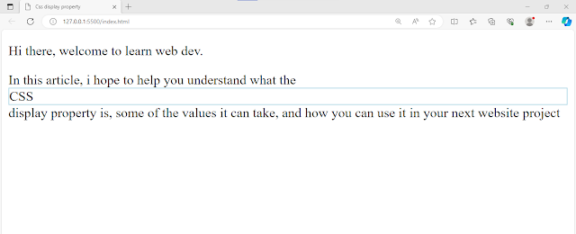
Display:block
block is one of the most common display
property values in CSS. An element with it’s display property set to
block starts on a new line and takes up the full width
available in its container element. Consequently, any other element
after it would be displayed in a new line. Additionally, you can set
the width and height of elements set to display:block.
A key note about elements set to display:block is that when
you set the width of the element to be smaller than that of the
container,
the element immediately after it would still be displayed in a new
line.
As mentioned earlier, elements such as div, section, p are set to
display:block by default.
You can use display:block when you want the element to take up
the entire available width of its container.
Display:inline
An element set to display:inline doesn’t
take up the entire available width. It takes up only the amount of width
given it by default. Setting the width and height of such elements have
no effect.
Elements such as span, img, a (anchor), are set to
display: inline
by default.
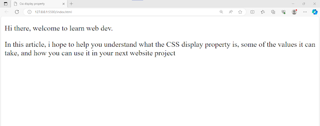
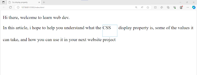
let's see an example. Using the span element we used earlier, let's set the display back to display:inline in our CSS code.
📌 Did you notice the difference between display block and display inline?
An element set to display:block is displayed in a new line and takes up the entire width of its container. On the other hand, an element set to display:inline doesn’t start in a new line and takes up only the needed width.
Display:inline-block
Elements set to display:inline-block are displayed as inline elements, that is, they do not start in a new line. Additionally, you can set the width and height of such elements. So, just as the value name suggests, we get the benefits of both inline and block level elements.
📌 did you notice the difference between display:inline-block and display:inline?
While both display values would cause an element to be displayed as
an inline element, display:inline-block also gives the
advantage of being able to set the width and height of the
element. On the other hand, width and height settings have no effect
on elements set to display:inline.
Display:none
When an element is set to display:none, the element is completely removed from the page. This complete removal means,
· the page would be displayed as though the element does not exist,
· if the element is a parent element, it’s children would also be removed from the page, and
· the element would not be accessible by screen readers.
After adding the CSS line above and saving your edit, you would have an output similar to this...
Notice that both the paragraph and its child element (span) are completely removed from the page.
There is another CSS property and value you can use to prevent an element from being displayed on the page, that property and value is visibility:hidden. let's talk very briefly about the differences.
Display:none vs visibility:hidden-what is the difference?
While both display:none and visibility:hidden would prevent an element from being displayed on the page, both properties do not have exactly the same effect. Setting an element to display:none would cause the element to be completely removed from the browser's display of the page. The page would be displayed as though the element never existed. This also makes the element inaccessible to screen readers. On the other hand, setting an element to visibility:hidden would cause the element to take up the space it would normally take but without displaying anything.
The image below shows this the effect of using visibility:hidden on the span in place of display:none
You use display none when you want the element to be completely removed from the display.
Display:flex
When an element is set to display:flex, the
element is displayed as a block-level flex-container. This means the
element would be displayed on a new line and also take up the entire
width of its parent container. Additionally, the children of the element
become flex-items. These flex-items can shrink or grow to fit the
flex-container (the parent element that has being set to
display:flex) . Additionally, flex-items can easily be aligned
within the container. This feature of the flex layout system and more
make it easy to design a responsive layout for our web pages. You can view this article to learn more about the CSS flexbox.
📌 Display:block vs Display:flex- What is the difference?
Display:inline-flex
An element set to display:inline-flex is displayed just as an element set to display:flex but with just one difference. The difference is , this time, the element is displayed as an inline-level element as opposed to block. In other words the element only takes up the needed width and height or the user-defined width and height, and its children are displayed using the flex-layout.
let's see an example. First though, let's update our HTML code a bit...
Display:grid
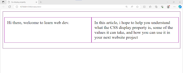
An element set to display:grid is displayed as a block-level element (that is, it is displayed in a new line and takes up the entire width of it’s container element) while it’s contents are displayed using the grid-layout. The grid layout is a layout in which elements are displayed using rows and columns.
let's see an example. let's set the display type of the div element in our CSS to grid
save your edit and refresh your browser. you would get an output similar to this...
Display:inline-grid
An element set to
display:inline-grid
is displayed just as an element set to
display:grid but with just
one difference. The difference is, this time, the element is displayed
as an inline-level element
as opposed to block. In other words the element only takes up the needed
width and its children are displayed using the grid layout.
lets see an example. Update your CSS.
Save and refresh your browser. you would have an output similar to this...
Notice that the grid container no longer takes up the entire width like a block element would. it is now being displayed as an inline element while at the same time giving us the opportunity to adjust it's width and height. Also, notice too that the span element we added after the div is an inline element. So it can be displayed along the same line as the inline-grid element instead of starting in a new line like a block element would.
Display:inherit
An element set to
display:inherit inherits the display
property and value of it’s parent element. If the parent element is set
to display:block, a direct child
element set to
display:inherit would then
be displayed as a block-level element.
let's see an example. We know that by default the p (paragraph) element is set to display:block. let's set the span of the second paragraph to display:inherit. First though, let's reset our div so that the output is easier to comprehend.
Save your code and refresh your browser. You should have a similar output as the one shown in the image below...
Now, let's set the span to display:inherit
Save your CSS update and refresh your browser. You should have an output similar to the one shown in the image below .
Display:initial
An element set to
display:initial is displayed using its
default display value.
let's see one final example. let's set the span element to display:initial.
Conclusion
Having a good understanding of the display properties available in CSS would equip you to build your website's interface just as you would love it to be. This article has discussed briefly 10 of the most common CSS display property values needed for building both responsive and beautiful looking layouts. Please feel free to use this article as quick reference on each of this display property values whenever you need to.
Thank you for reading to the end.
Check out these helpful links to learn more about the CSS display property and it's values.
This documentation provides a deeper discussion of the subject if you are interested


Comments
Post a Comment